Design + Consulting Studio

Blog

Posts tagged interior design
Not So Boring Beige
Screen Shot 2020-04-18 at 2.10.41 PM.png

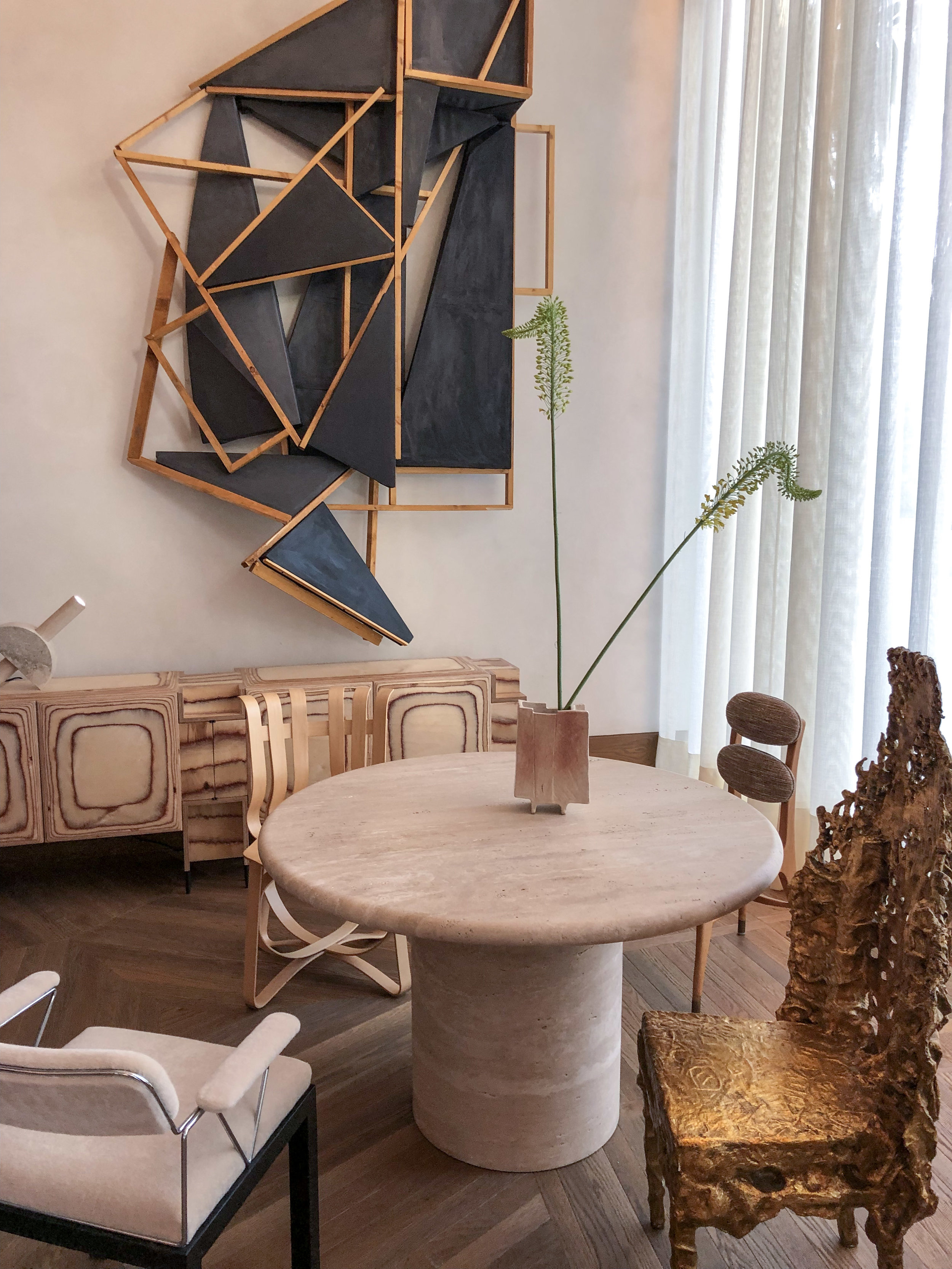
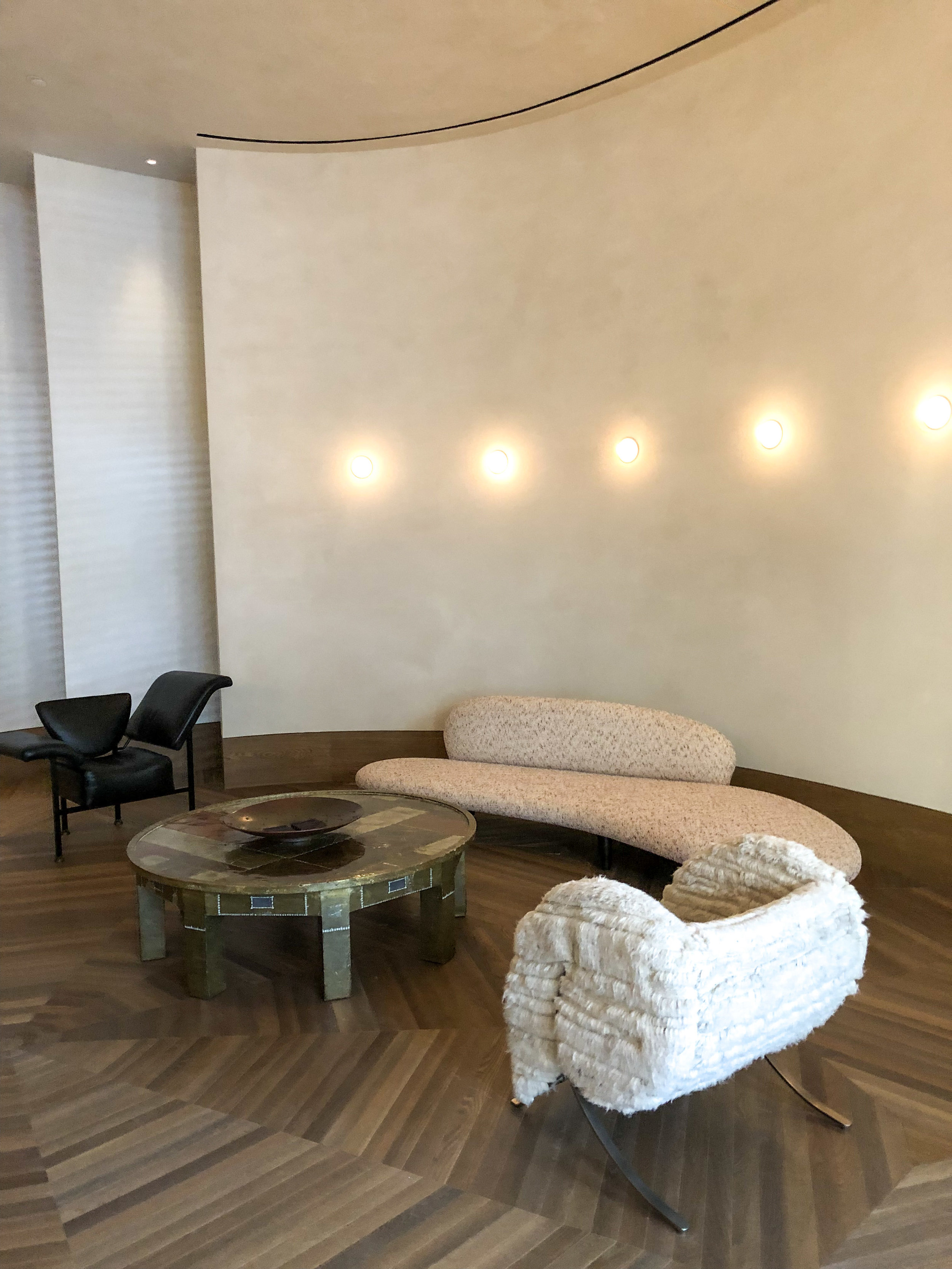
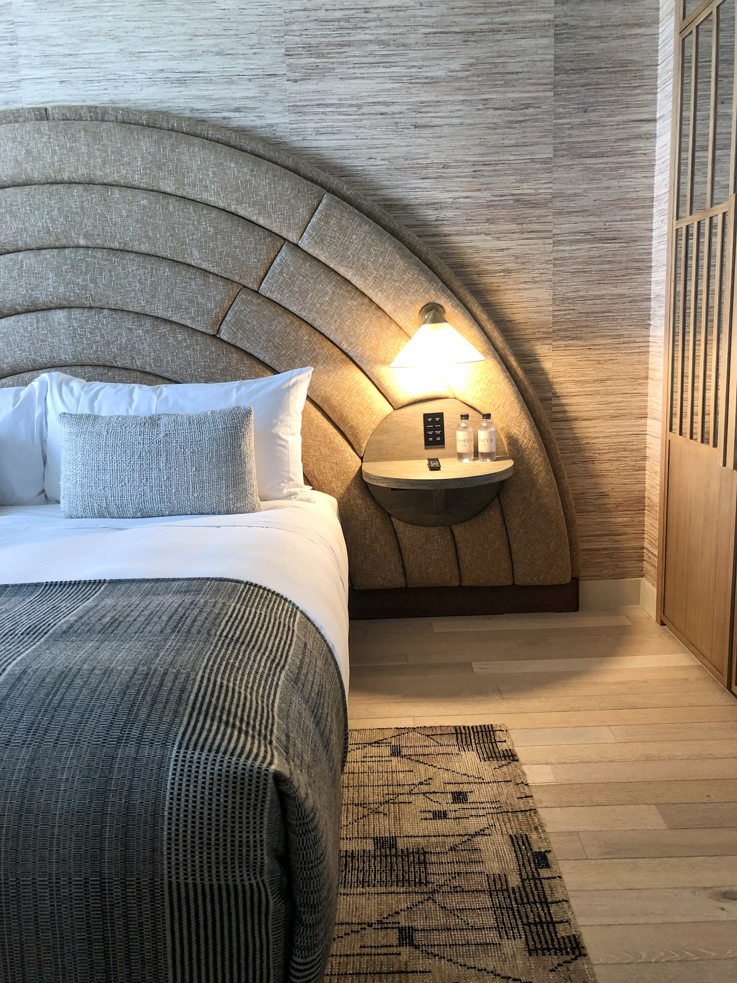
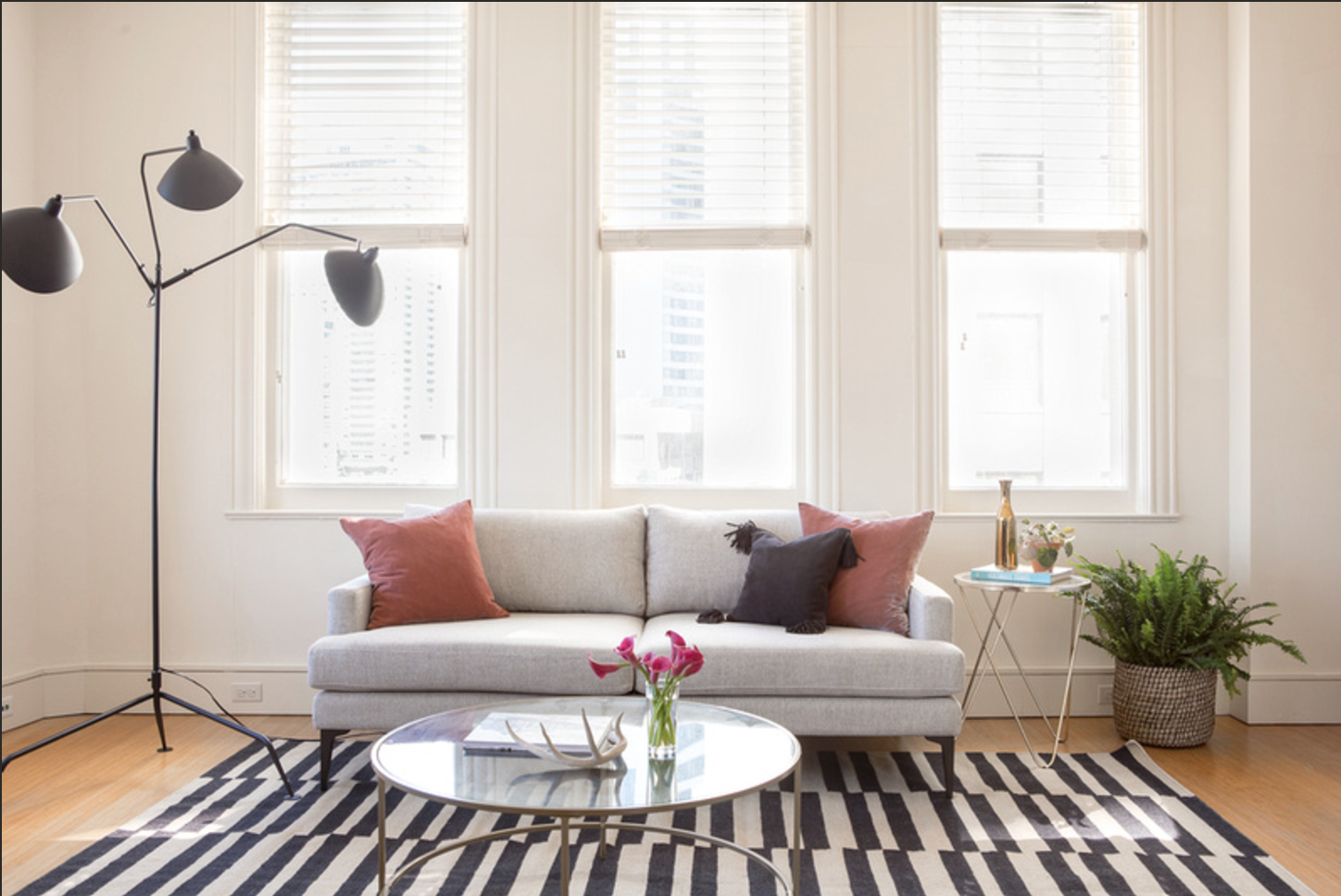
Beige seems to be making a comeback if you will. It wasn’t so long ago that every design neutral was grey, cool grey or warm grey. Now though, the ubiquitous grey tones have been replaced with earthy sandy colors harkening back to a simple earthy vibe. Maybe its because we are all spending so much time at home these days and for the foreseeable future. Yearning for the simplicity of nature and to create a calming respite from the chaos that exists outside our front door. 

Screen Shot 2020-04-18 at 2.14.12 PM.png

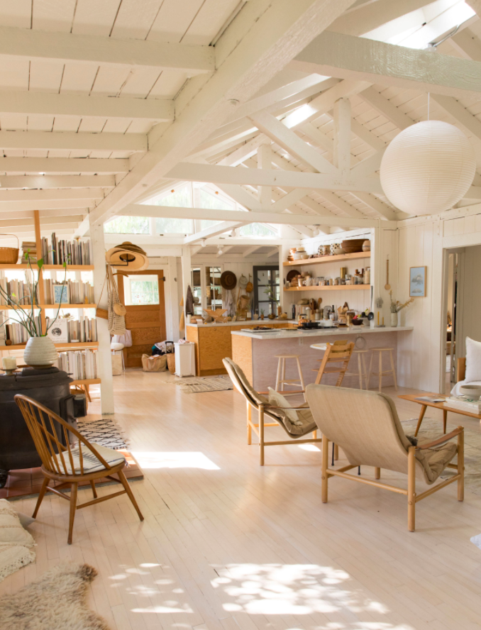
I see it with myself, paring down every table scape and shelfie to a calm, warm neutral palette. Pulling back loud patterns and rich colors. I am gravitating to whites, beiges, browns, terracotta, rose, clay colors. And I find myself wondering why. There is a purity in these colors, a feeling of going back to the basics and to the foundation of color and texture. I want my eye to rest when I am home and I am finding my clients often feel the same. Right now we are in such a state to overstimulation I am craving a palette of calm and I think we find it in the colors and textures that lead us back to the earth, back to basics. 

Screen Shot 2020-04-18 at 2.28.06 PM.png


Proper Santa Monica
Screen Shot 2019-09-28 at 2.56.33 PM.png

The latest and greatest from one of my favorite designers Kelly Wearstler. Of course I had to come up with an excuse to go visit and stay in the new Proper Santa Monica Hotel, a meeting in Santa Monica gave me the perfect reason to escape!

The whole space is beautifully curated and feels at once luxe, but attainable. Otherworldly sculptural furniture elements mix with natural, simple materials making for a dynamic and eye pleasing combination. I spent more time then I want to admit walking through the lobby and restaurant taking in the wood and upholstery choices and eyeing each light fixture and hard surface choice. It feels both wild and restrained which is a difficult combination to reach.

While The Proper San Francisco is a whirlwind of pattern and color choices, with jewel tones and blacks contrasting each other, The Proper Santa Monica feels quieter, simpler. You can feel the inspiration of nature, beach sands and organic materials guiding each choice. The underlying vibe is still sexy and sleek, but with a different note this time.

IMG_4915.jpg

After dinner and a beach walk, I found myself back in my room excavating each surface and material choice. Wide plank light oak floors lay the natural palette while each furniture item is curved, no right angles in sight. An interesting choice, but something I have seen recently trending in furniture styles- more curves and soft lines than ever before. This sets an unconsciously soft and soothing sense to the space. The oversized, half moon shaped upholstered headboard makes you feel secluded and encapsulated in softness. The quality of all the materials is obvious and felt throughout- solid woods, rich wools, simple linens.

Overall I loved my stay, and felt comfortable and relaxed. The environment was perfect for a quick working getaway and reminded me once again of the power of a beautiful interior. The impacts of beautiful spaces are so profound and can trigger inspiration when you least expect it. Thanks Kelly for another beautiful space to inspire!

1/

I Want To Go: The Lodging
Screen Shot 2017-11-04 at 10.19.40 AM.png

Check it. The Lodging in Freemantle. I love me a good boutique hotel and black and pink and fab photos hits it in all the right spots. This little lady is a refurbished 1800's terrace house. Cant beat the look of modern and traditional all wrapped into one. This is a great example of how a really simple color palette and restrained design can make a huge impact on a space. 

Get me a ticket to Australia stat! 

Screen Shot 2017-11-04 at 10.18.45 AM.png
Screen Shot 2017-11-04 at 10.19.02 AM.png
all images via The Lodging 

all images via The Lodging 

CANT TUFT THIS
Screen Shot 2017-09-24 at 9.38.06 AM.png

I have been looking at a lot of furniture lately (as usual!) and I am seeing tufted upholstered furniture everywhere! What used to be typically symbolic of traditional style, tufting is now being used in conjunction with clean lined modern pieces. I am loving this eclectic juxtaposition with furniture. It really adds a rich and unexpected twist to a room. Besides the stylistic element tufted in a great thing to consider in terms of furniture longevity as tufting usually requires more fabric just due to the construction is pulled tighter than a traditional sofa = so saggy fabric. Prints, velvets, leathers, linens- keep you eye on tufted furniture as I know you have not seen the last of it. Before you know it there is going to be reverse tufting, patchwork tufting and then we will all be tufted out. In the meantime peep these great styles that will look fab in virtually any space. 

image via Design Chaser

image via Design Chaser

Image Via Glitter Guide

Image Via Glitter Guide

image via pinterest

image via pinterest

Stay in Style
Screen Shot 2017-09-23 at 4.02.08 PM.png

Well its been awhile since I've frequented this space! If you follow along instagram you know I have been permanently posted between airports and various cities around the world #designlife. Excited to share a little interview that Society6 was kind enough to do with me a few months back about our design philosophy and how we approach all these beautiful spaces for Sonder. You can read the whole article here . 

Screen Shot 2017-09-23 at 4.11.05 PM.png
Stylin' in NOLA

Whoa its been a whirlwind and I'm just catching my breath before we keep on rollin. Spent all of last week in beautiful New Orleans working on one of our newest Sonder properties and as usual I had a blast exploring the city and designing on the fly. Nothing like arriving to a new city with a photo shoot scheduled and working under the gun to make it happen! 

First things first- painting and setting the stage. Luckily I had a great group of locals to show me all the spots to find the accessories we needed to add the perfect NOLA flavor to our units. And install! 

I had a blast sorting through vintage shops looking for cool finds- old coffee bags, found bottles, and amazing street photographs were some of my favorites that I took home with me.

Then its time to shoot- one of my favorite things! I always say no matter how great your work is, if you are not working with a stellar photographer it will never shine! Luckily we were able to get the amazing Jacqueline Marque to shoot for us, and I had so much fun collaborating with her and can't wait to do it again! 

And voila! Sonder's are ready for you if you are heading down to NOLA anytime soon! 


Gray Malin Before and After

Always on the road! I just got back from an amazing shoot from our newest Sonder property in New Orleans. I cannot wait to show you guys! While I was away a design that I did a few months back for the photographer Gray Malin came out and I am so thrilled about it! Gray has such a fun and distinct personal style that I was really excited about the prospect of creating a space that reflected him and his lifestyle. 

Gray had a very specific idea of what he wanted for the space, so we started out with his inspiration board. It was a mix between Palm Springs and mid century. I was off and running! 

BEFORE 

BEFORE 

The space was just a typical garage filled with lots of stuff! We did some cleaning of the space and then go started with the design. Luckily Gray loved most of the design that I came up with so the design process was very quick! Gray really wanted the space to be multi functional- a guest space, a hang out space for next to the pool, a work area. And I think we got it all! See yhe whole reveal here and also on Gray's site here

Time for a swim!